In this post, I shall share with you everything you need to know about mobile SEO in 2024.
I shall also tell you why mobile optimization is necessary now?
In addition, I will also help you to ready your website for Google’s mobile first algorithm.
Mobile SEO guide in 2024 – The Definitive Guide
CHAPTER 1: Mobile Optimization 101
In this chapter I’ll help you to learn the basics.
So if your site is not mobile optimized or you are not sure, this chapter will move you to the right track.
In upcoming chapters, you will learn advanced strategies and techniques.
What Is Mobile SEO?
Mobile SEO stands for the practice of optimizing your website for users on tablets and smartphones or android. It also refers to make your site resources accessible to search engine spiders.
Why Is Mobile SEO Important?
In short: the number of mobile searches is increasing day by day.
In fact, 58% of all searches in Google are now done from a mobile device.

This trend is growing rapidly. According to statistics of Google, mobile has 27.8 billion more queries than desktop.
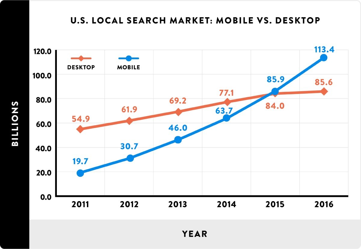
So the mobile is the future of SEO. This is the reason why Google and its algorithm are focussing on mobile search.
SEO in 2019: The Definitive Guide
Is “SEO” Now About Optimizing for “Mobile SEO”?
Yes, if you want to optimize your site for Google.
Today, 95% of searches are from the search engine of Google.
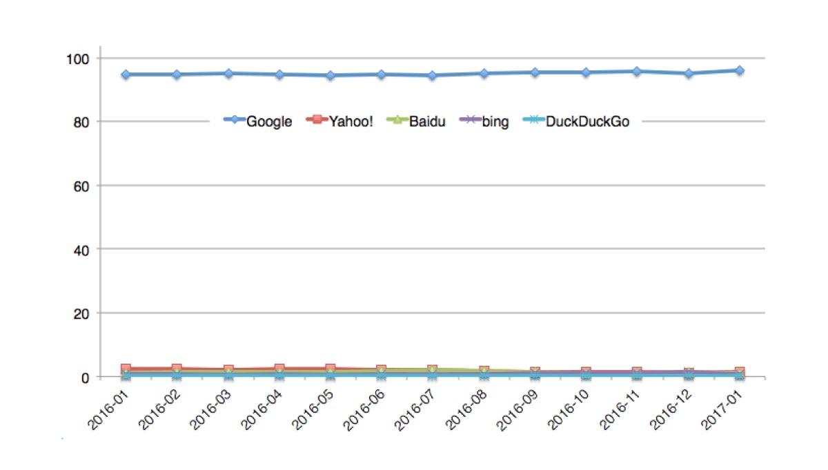
Google will retain this level of dominance by twisting their algorithm.
So you need to optimize your site for mobile users first.
Firstly, Google launched its Mobile-Friendly Update (which many people called “Mobilegeddon”).
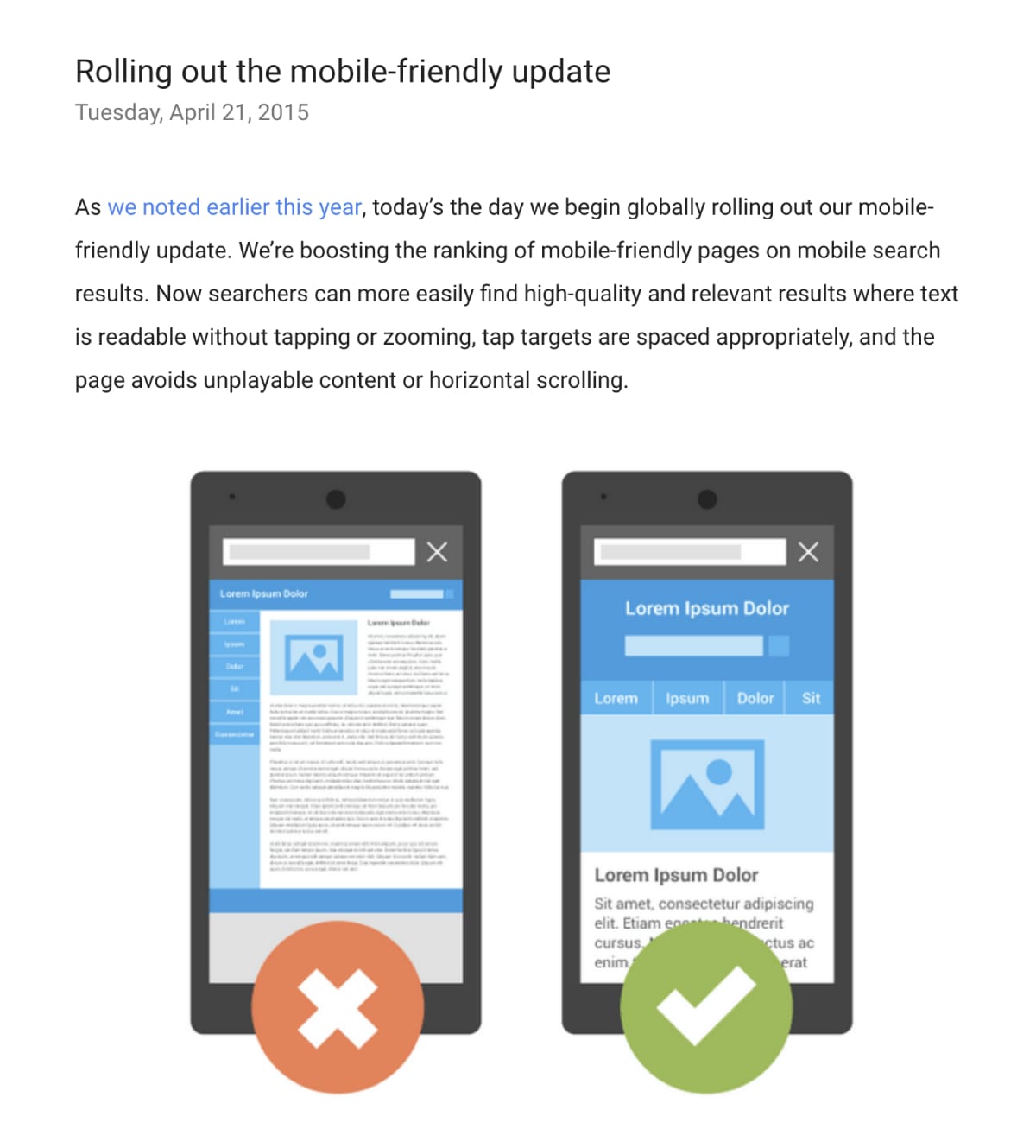
This update affected those sites which were not mobile friendly for android or smartphones.
If your target audience does not search using their smartphones, this update was not a big deal for you.
Unless Google made every search a mobile search by implementing its Mobile First algorithm.
What Is Google’s Mobile-First Index?
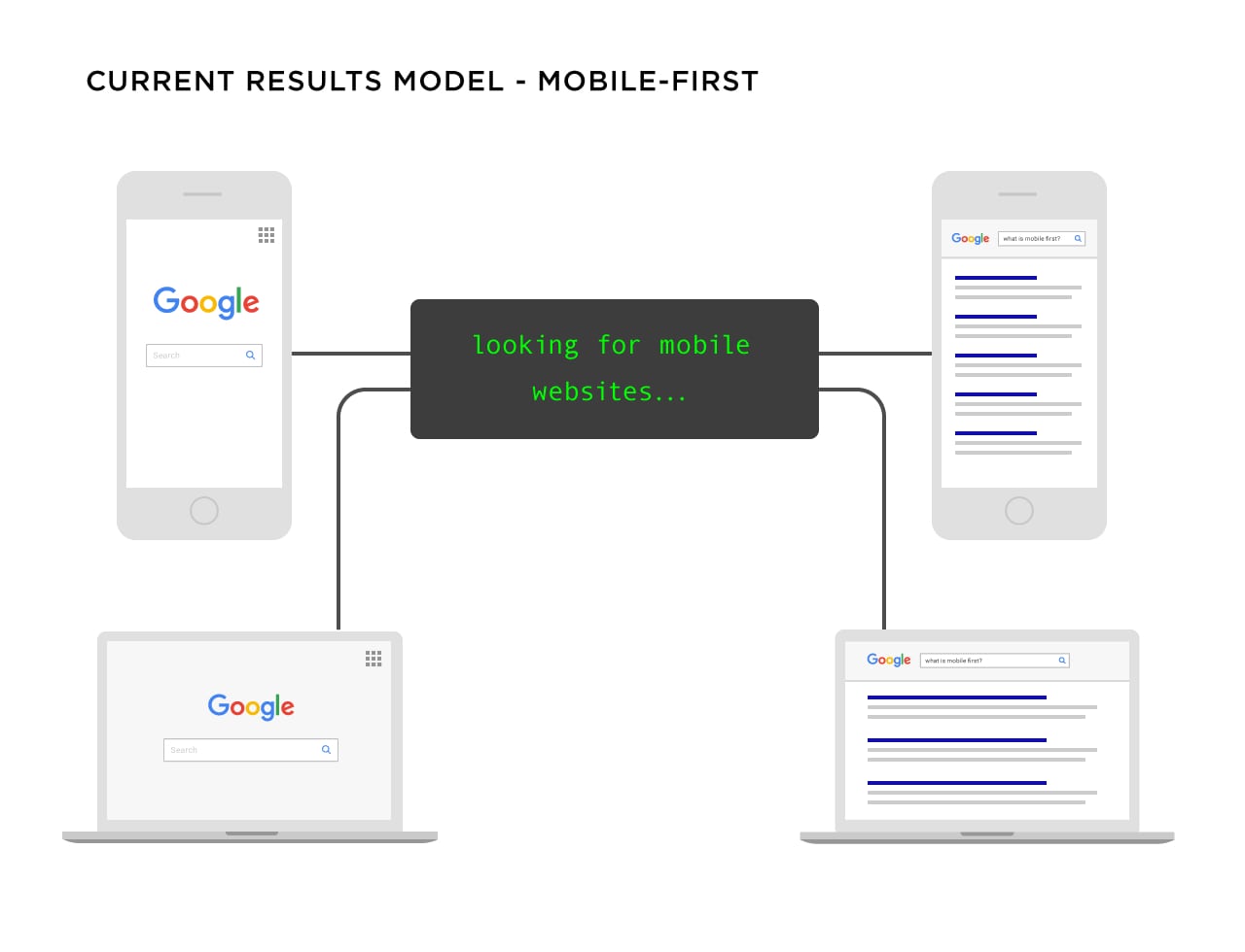
Google Mobile first index will rank the search results according to the mobile version of the page. It occurs even if you are searching from a desktop as well.
Before this update, Google ran two indexes side-by-side: desktop version and mobile version.
If someone is searching from an iPhone or android, Google will show them results from mobile index. If someone searches on a desktop, he will get desktop results.
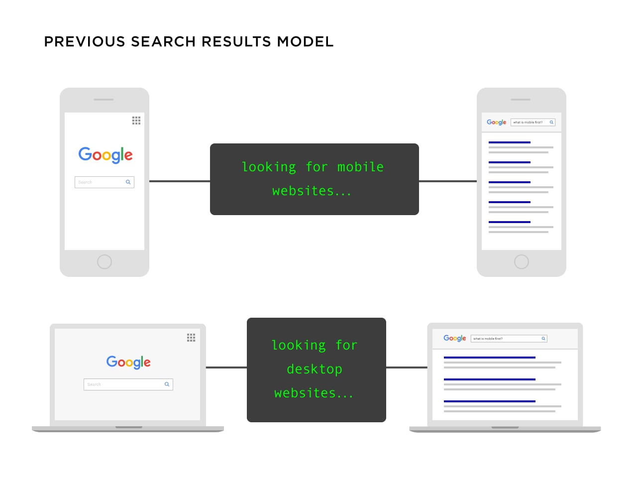
Today, it does not matter what device you use, Google will show you the results from mobile index.
I shall discuss more about optimization for mobile SEO in chapter 3, 4 and 5.
Is Google’s Mobile-First Index a Big Deal?
It depends.
If your site is optimized for mobile, you are good to go.
If your site….
- Loads resources across all devices
- Does not hide content on mobile versions of your site
- Loads quickly like mobile users expect
- Has working internal links and redirects
- Boasts a UX which is optimized no matter what device your visitors use
If all is done, you are good.
If not, Google may drop your rankings.
Therefore, I am making this whole guide for you to optimize your site for mobile.
Firstly….
What Does Google Consider “Mobile”?
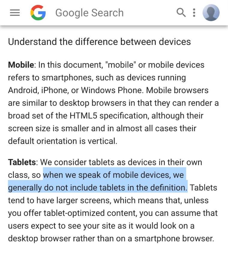
Most of the people consider “mobile device” a table or smartphone.
Google puts tablets in their own class and states that they do not include tablets in the definition.
In short, according to Google: mobile=smartphones.
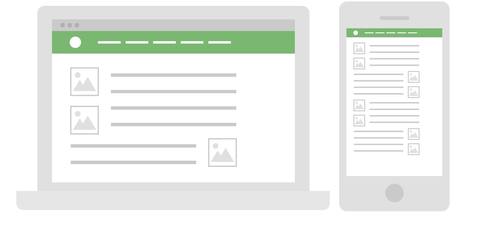
The main purpose is to optimize your site and content for every device. It includes tablets, phones and other mobile devices.
Image on right side
CHAPTER 2: How to Implement a Mobile Website That Ranks in Google
To get over mobile SEO, your site has to work on mobile devices at least.
If a visitor goes to a mini version of your desktop site, you will be in trouble.
Luckily, to implement a mobile website is not a hard nut to crack.
So in this chapter, I shall teach you different ways to implement a mobile version of your website by focussing on mobile SEO.
When It Comes to Mobile, You’ve Got 3 Options
There are 3 different ways to configure your site for mobile.
1
First of all, you have got separate URLs which is also known as“m” configuration.
With this setup, you have a mobile version which is “M” version of your site and you also have the “main” means desktop version of your site.

In short, your site figures out what type of device your visitor is using and redirects them to optimized URL for that device.
Separate URLs were common in the past but now, not anymore.
Why? It is because they are hard to manage.
“M” version creates SEO problems and you require multiple URLs for every piece of content on your website. It also needs complicated “rel=canonical” and “rel=alternative” tags.
That is why I do not suggest M/separate URLs configuration. It is the worst way to configure your website for mobile SEO.
2
Next, we have Dynamic Serving.
When you serve content dynamically, all of your content is on the same URL. But you show every user different CSS/HTML that depends on the device that they use.
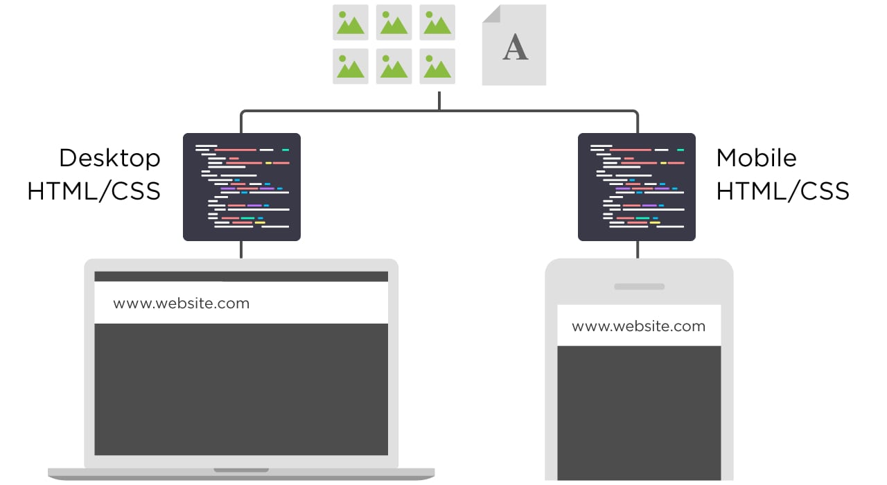
For example, if you visit https://www.greenhatexpert.com/seo-this-year on a desktop, you will see a pre-made desktop version of the site.

But if you will visit the page from your iPhone 8, you will still be on https://www.greenhatexpert.com/seo-this-year but you will see the iPhone 8 version of the page.

Dynamic serving is a better choice for SEO as compared to “M” version of the site. It has some downsides.
For example, it is notorious for showing desktop version to mobile users.
You need to create different versions of your content for upcoming devices. If you do not do this, your site will not be able to recognize a new device. And will show them the terrible version of your site.
3
Finally, we have Responsive Design.
I saved the best for last.
With the help of responsive design, the content and page’s layout responds to every user.
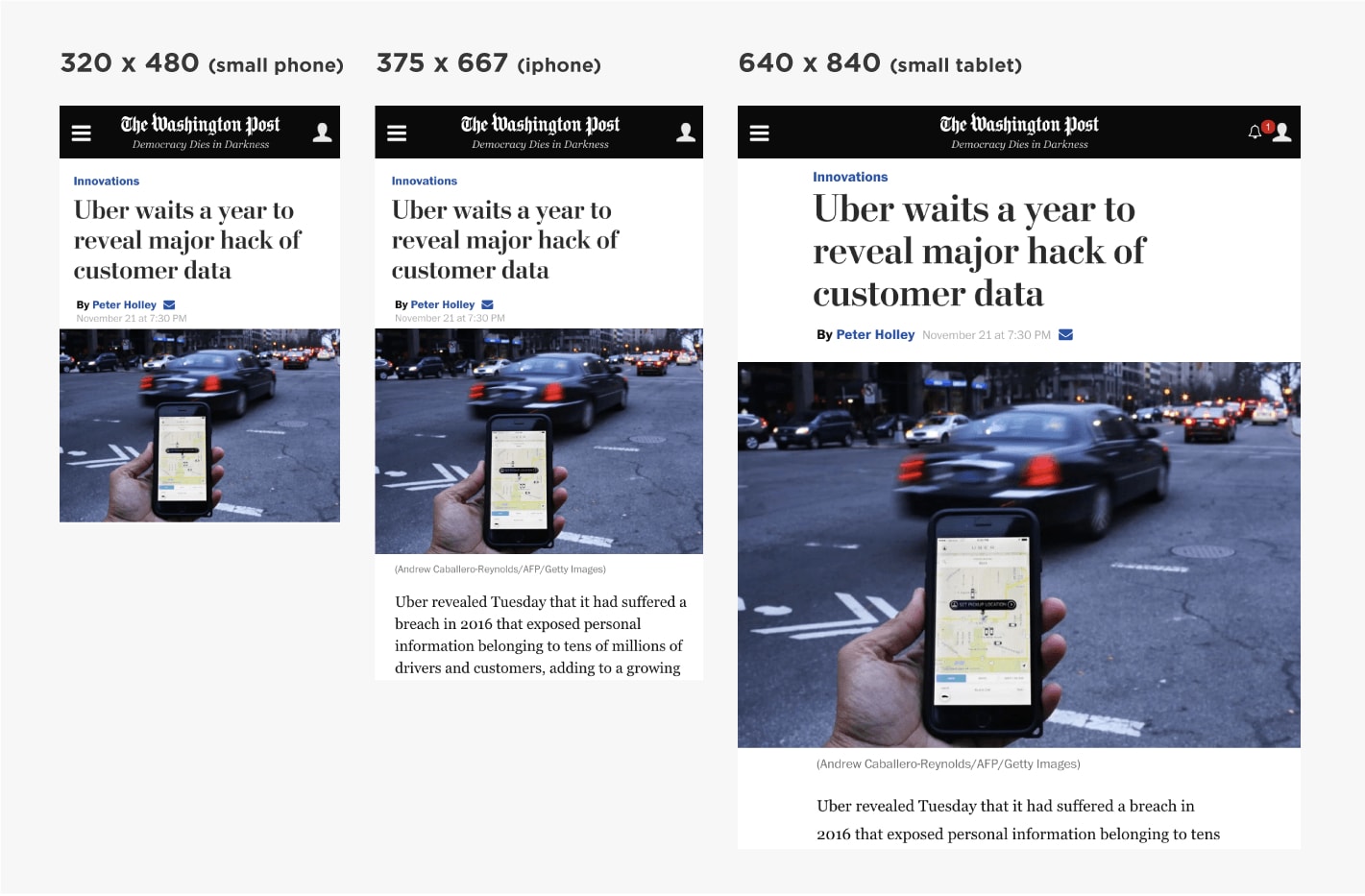
Responsive design gets rid of separate URLs and different HTML for every device.
In case of being SEO friendly, responsive design is the best and perfect option.
Why?
- All of your content is on a single URL (good for sharing and getting links)
- Minimal SEO headaches (no “rel=canonical tags”, duplicate content issues etc.)
- Insanely user friendly (UX is a big part of SEO thanks to RankBrain)
- No redirects (which cause technical SEO issues and can slow down your site)
Still not convinced? Google recommends responsive layouts.
CHAPTER 3: How to Mobile Optimize Your Site
After going through 2 chapters, your site is configured for mobile users. Now it’s time to do mobile SEO.
In this chapter, I shall show you how to tell Google and other search engines that your site is optimized for mobile.
Use Google’s Mobile Usability Test
This tool is available in Google Search Console and it will let you know the issues of your site regarding mobile usability.
To use it, go to your Google search console account. Click “search traffic”>Mobile usability.
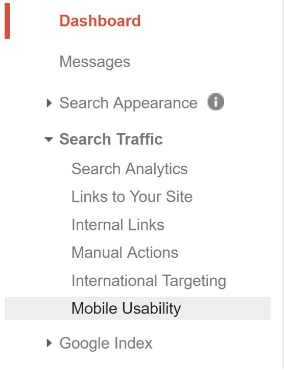
There Google will let you know if your mobile users are facing any problem.

(For example, the tool may let you know that you use Flash or that your font is too small for mobile users to read).
You can also use Google’s Mobile-Friendly test.
Just enter your URL into the tool.

And get a full report.
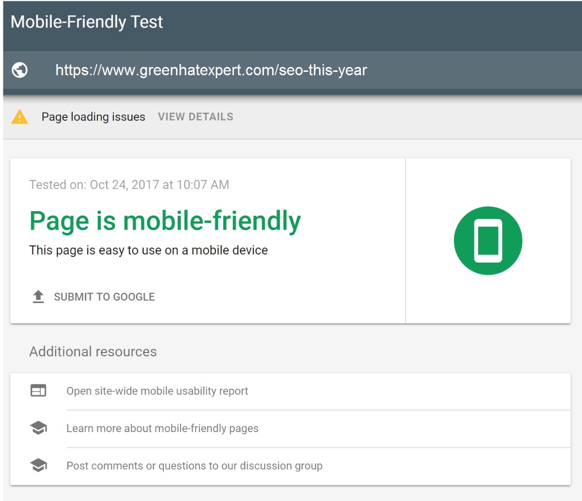
As you can observe, I passed. But it is telling me that mobile Googlebot is having trouble to load all of my resources on my page.
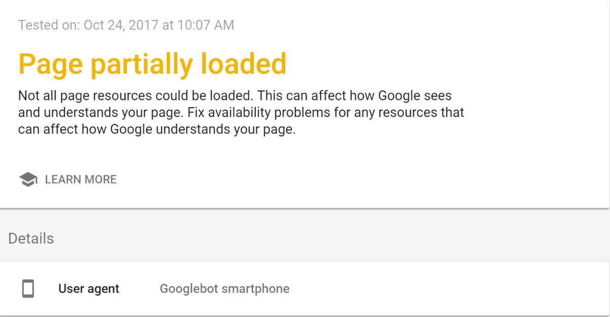
Desktop Googlebot is having no problems to crawl the resources. But the mobile version is unable to do it.
With Google’s Mobile first index live, it is a serious issue. And this is something which remains unknown without this tool.
Super duper helpful.
Let Google Crawl Everything
Do you block Googlebot from accessing Javascript, CSS or other important parts of your site’s code?
It used to be no big deal. But today, it is a very bad idea.
Until Google cannot fully crawl your page, it cannot tell whether it is mobile friendly or not.
How do you know if this is an issue?
First of all, check your robots.txt file.
This file tells Googlebot to not index or crawl certain parts of your site. This file is usually available at site.com/robots.txt. You can also find it inside of Google search console.
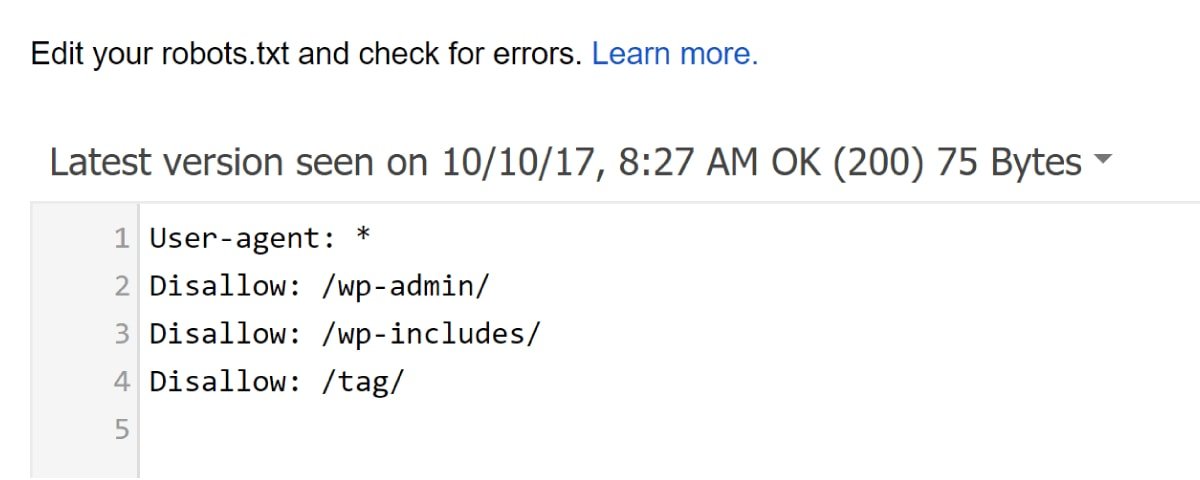
While you’re there, click on “Google Index” —> “Blocked Resources”. This will let you know if you’re blocking Googlebot from crawling certain parts of your site.
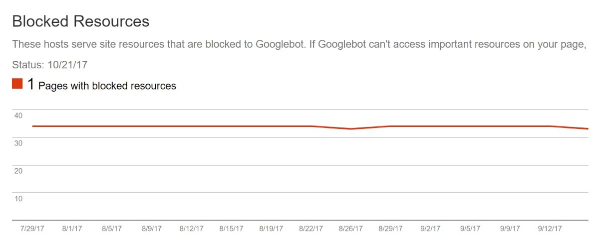
If you are not blocking anything important, you are good to go.
Put the Kibosh on Interstitial Popups
I know: everyone HATES popups.
Google also hates popups….. especially for mobile users.
Remember: Google #1 priority is to show their users amazing and engaging content. If the content is hidden behind a popup and it is not a good thing.
In fact, Google rolled out an update that specifically targets “Intrusive” popups.
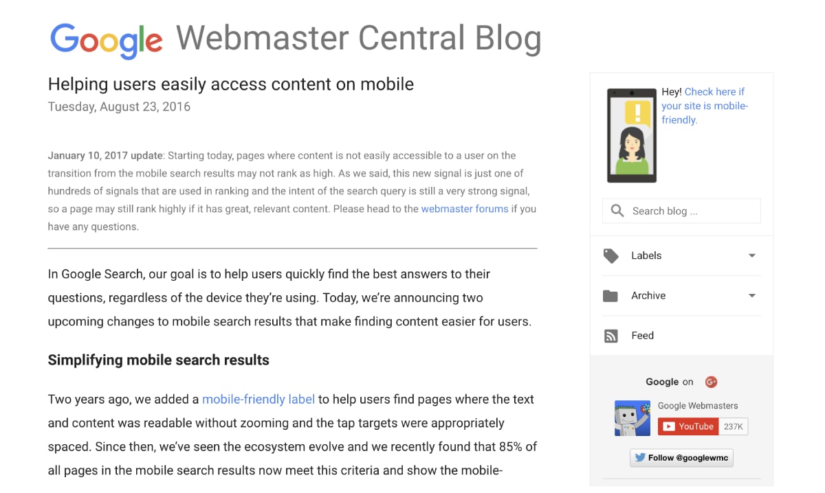
So if you are using popups on your site, it can affect your rankings.
How do you know which popups are OK?
Google gives a few examples of acceptable popups…

…and popups that can get your site penalized.
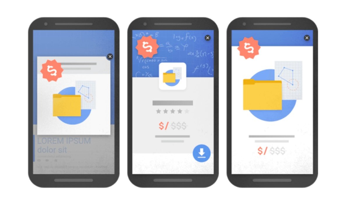
How Does Your Responsive Site Actually Look? Check Out This Cool Tool
It is to see how Google views your mobile site.
But nothing can beat seeing your site on different devices.
If your site is responsive, I recommend checking this free tool.
It’ll show you how your site looks on iPhones, tablets and more:
Image
I love this tool.
Use The Mobile Version of “Fetch as Google”
Like most people, I’m a visual learner.
It is a nice thing to see a list of mobile SEO issues.
Personally, it is more helpful to know how Google sees my page.
Therefore, I suggest spot testing a few pages on your website using Google search console’s Fetch as Google feature.
Just enter a URL of a prominent page of your site into it:

(Make sure to select “Mobile” from the dropdown box)

And it will show you exactly that same result what Google Bot saw. You can also scroll down to see if Google missed anything like videos, menus and images etc.
Image
Very helpful.
Let Mobile Users See It All
In past, people would block certain resources from mobile users.
(For example, they might block javascript from loading or hide some content)
They were not doing anything suspicious. To block these resources allow them to load their page faster on mobile devices. It also improves the user experience.
Here is an example of what I mean:

See you need to click “read more” to watch the rest of the content. It may be a problem with Google’s first mobile index.
Why?
With Mobile-first, Google will consider the mobile version of your page as the main version.
If the content is hidden from the mobile visitors, it may not crawl or index or affect the weight of this content.
Back in the day, when it came to hiding content for desktop users, Google has said that:
“If something is relevant to the page, then it’s probably relevant to the user too, so I’d recommend showing it to the user.”
But then Google’s John Mueller recently said that, for the Mobile-first index:
“On the mobile version of the page it can be that you have these kind of tabs and folders and things like that, which we will still treat as normal content on the page. Even if it is hidden on the initial view.”
He also said that, when it comes to Mobile First Index:
“If it’s critical content, it should be visible.”
I shall wait for the official announcement on Google blog before saying anything on this.
In the meantime, here’s my take:
If you will hide or block the content for mobile users, Google will put less weight on it or simply ignore it.
So observe your website on different mobile phones. If desktop users can see something and mobile users are missing it. I suggest that fix it asap.
CHAPTER 4: How to Optimize Your Mobile Sitefor UX Signals
As you know, SEO today is less about focussing on meta tags and more about building an awesome website.
In fact, Google’s RankBrain algorithm is paying attention to Google searchers and how they interact with your site.
If RankBrain observes that your is frustrating for mobile users, it will drop your rankings like a stone.
In this chapter, I shall show you some tips that make sure that mobile users love your website.
Master Mobile Sitespeed
Does Google care how fast your mobile site loads?
Yes.
In fact, they recommend that your site should load under a second for mobile users.
That is a hard nut to crack. Luckily, there are some free tools on the market to help you to reach Google’s guideline.
First of all, we have Google’s PageSpeed Insights tool.
This tool allows you to know the time of site load on mobile.
In addition, it also gives you suggestions that you can use to speed up.
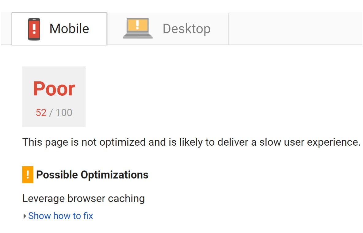
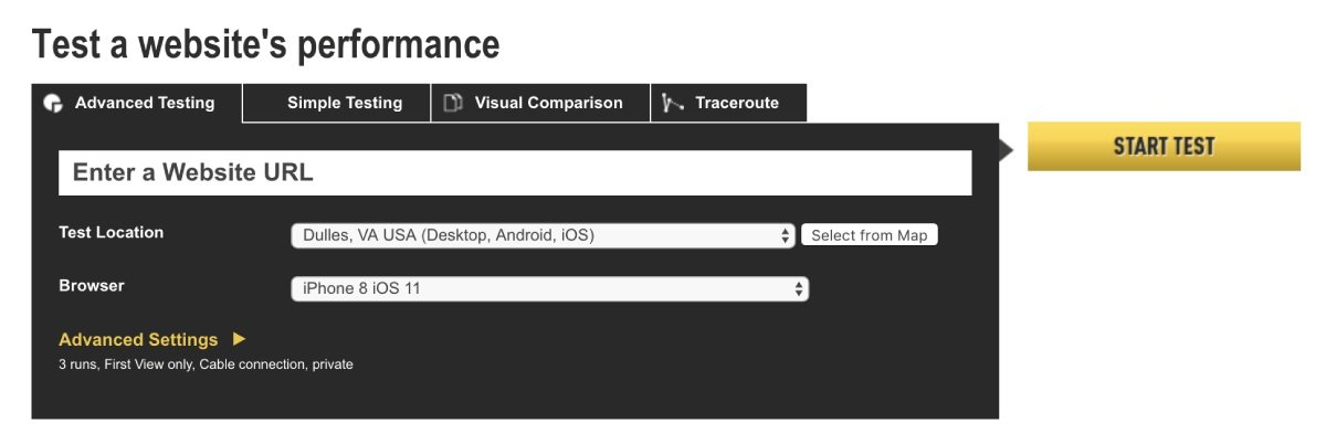
You can also check out WebPageTest.org. By default, it will load your site on a desktop browser. You can select a mobile browser from the menu:
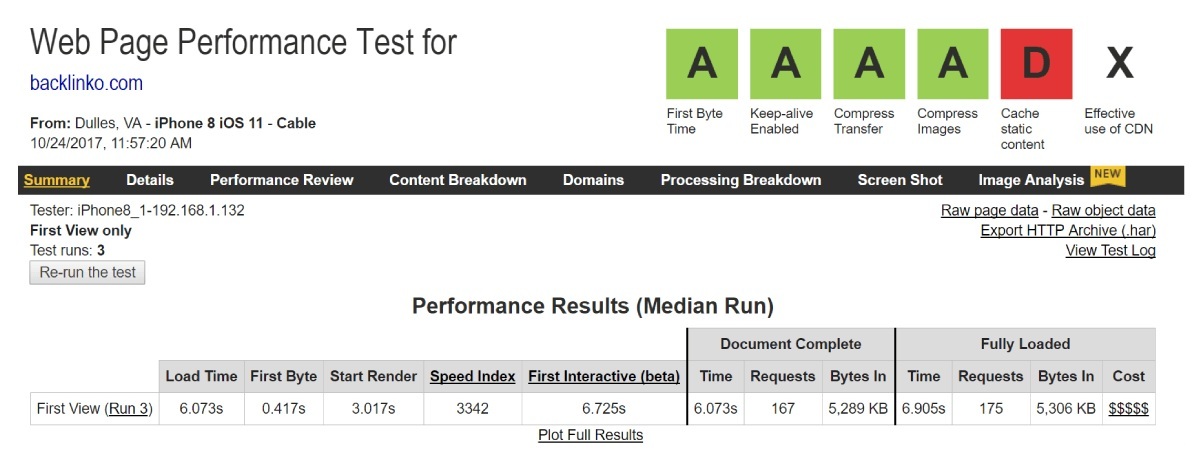
And it will give you a list of suggestion which are for mobile browsers:
If you are really interested in pagespeed, check out this excellent resource.
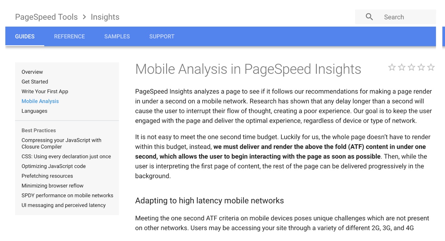
This guide will help you to load your site like lightening.
Make Your Content Insanely Easy to Read on Phones
Do users have to pinch, scroll or squint to read your mobile content?
So they will press the ‘back’ button.
For example, you don’t want your content to look like this:
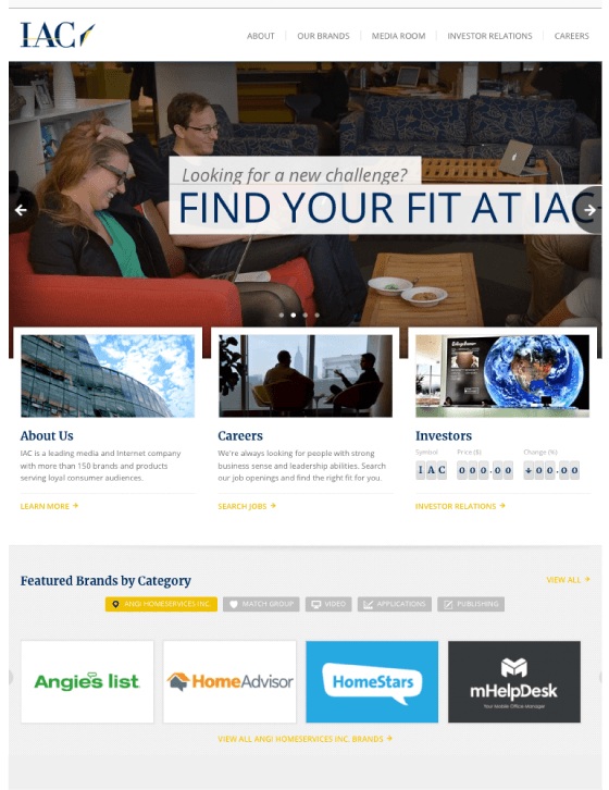
Yes, this page is optimized for mobile. But it is hard to read.
You need your font to be big, bold and legible:
So:
How can you make your mobile content more readable?
- Use at least 14px font (I prefer 15 or 16)
- Use short paragraphs (1-2 lines per paragraph)
- Go with a line length between 50-60 characters
- Make sure there’s tons of contrast between text and background (people use phones outside, which can make low-contrast text harder to read)
It is also helpful if your content is good and interesting but that is another thing.
Use HTML5 For Video and Animated Content
Do you embed videos in your content?
Does your page perform all sorts of fancy animations when people visit?
If the content is coded in flash, it will not work on mobile devices.
Instead, you need to code that up in HTML5.
Don’t Forget the “Viewport Content” Tag
Do you use responsive design?
If yes, do not forget the viewport meta tag.
This tag changes the size of your page based on the device of user.
Google also suggests that you setup your viewport meta tag like this:

If you will forget this tag or you will not configure it correctly. Your site will look funky to mobile users.
You have double check it to know that you have set this up.
Implement These 3 Quick Mobile UX Hacks
These are 3 quick tips designed to boost the usability of your site for mobile Google searchers.
1
Make Header Images Really Small
Mobile Google users want to get answer now.
It means you do not have to use giant header images like this:

So delete them or make them smaller for mobile users or visitors:
Use Lots of “Negative” Space
Negative space is the space between buttons, text and design elements. It is really important for mobile websites.
On a desktop, you can use a covered page.
But on a phone, you cannot get away with a covered page.

It is very important for content which you want to rank in Google. If a Google visitor is having trouble to read your content or finding what he needs. He will bounce your site and will return to search results.
And using a lot of negative space, like this, is another way to reduce the bounce rate and improve the dwell time:
Put Social Share Buttons as a Tab Bar
The fact is: social sharing buttons can increase the amount of shares of your content.
Social share buttons work well when they are in a sidebar:
They do not distract but if someone wants to share, the buttons are right here.
The problem is: the setup is not possible on mobile.
Therefore, I suggest using a tool like Sumo that shows the social icons as a tab bar at the bottom of the page.
Image
Simple.
CHAPTER 5:Advanced Mobile SEO Tips and Best Practices
Now your site is mobile optimized, it’s time to take things to the next level.
In this last chapter of my guide, I shall give you an advanced mobile SEO tips, strategies and best practices.
Fix Your Mobile CTR, Get More Traffic
I do not need to tell you that your organic click through rate is a Huge Google ranking factor.
If Google will observe that the mobile users do not click on your result, it will downrank you.
But how do you know that your CTR is up to the mark? Here is the process:
First, go to the Google Search Console’s Search Analytics section.
Image
Next, click “Compare Devices”.
Image
And choose “Desktop” vs. “Mobile” and hit “Compare”:
Image
Now, take a look at how your desktop and mobile CTR size up.
Image
It is a normal thing for your desktop and mobile CTRs to be different here.
If you notice that your desktop CTR presses your mobile CTR for a certain keyword, search for that keyword in Google using your phone.
It can be that the mobile SERPs have more ads which are crowding organic results.
Or it can be your title tag is cutting off.
Either way, you will come with an insight which you can use to increase your mobile CTR.
Turn Mobile Donkeys Into Unicorns
Google’s Mobile first index means that Google will put more weight on mobile UX signals.
In simple words, if mobile users bounce from your site like crazy, it will put a negative effect on your rankings.
Therefore, I suggest compare your desktop vs mobile bounce rate and dwell time using Google analytics.
It is very easy and well worth.
To do it, login to your Google analytics account. Click Site Content>Landing Pages.
Image
It will show you the most popular pages on your website. Click on a page which you want to get more traffic to.
Image
Then click “Secondary Dimension”> “Device Category”.
Image
It will show you how your UX signals compare on desktop vs mobile.
For example, for this page, my bounce rate and dwell time are almost similar. So this page is probably optimized well for mobile users.
Image
But if Google analytics shows you the big difference between mobile and desktop users, then visit the page on your own phone.
You may find something bad that is causing mobile users to bounce your page.
When you are done, move to the next tip.
Boost Your Mobile Page Speed With These 3 Tips
After Google’s mobile-first update, Google will look into the mobile page speed. Will my desktop speed will still matter? Maybe.
But it will not get that importance as how your website loads on mobile.
Here is how you can skyrocket the mobile loading speed of your site.
First of all, do a mobile speed test at ThinkWithGoogle.com:
Image
This tool is similar to any other speed testing tool. It even loads your site on 3G to create the mobile environment.
It will give you a helpful report that will tell you how long your site takes to load on a mobile device.
Image
And also how to remove the speed breakers.
Image
Here are some other quick tips to try out:
- Smash your images: If you use WordPress, I suggest installing an image optimizer, like Smush Image Compression. These SIGNIFICANTLY reduce the file size of your images, which can speed up load times dramatically.
- Implement Browser Cache: Google themselves suggested caching your site to make your site load faster.
- Get a CDN: CDNs can make page elements (especially images) load 2-3x faster.
Optimize Title and Description Tags for Mobile SERPs
Do you get the majority of the organic traffic from mobile?
Then you need to optimize your title and descriptions tags according to the mobile search results.
Here’s how:
Google provides more title tag characters to work on mobile. But your meta description is short.
(Go figure)
Here’s the exact breakdown:
Desktop
Title: Approximately 70 Characters
Description: Approximately 300 Characters
Mobile
Title: Approximately 78 Characters
Description: Approximately 300 Characters
In short words, if your title tag is 69 or fewer characters, it will not get cut off on mobile or on desktop.
But let’s suppose you get more traffic from mobile. You may want to expand the title tag and take advantage of the extra space. Even if you exceed the desktop characters limit.
For example, your title tag looks like this:
Image
That’s 66 characters. So this title will show in-full on desktop and mobile.
Now suppose you wanted to use a word or phrase that can increase your CTR. Your title tag will be look like this:
Image
That’s 78 characters.
Yes, 78 characters mean that Google will cut your title tag on desktop searches. But it will show up just fine on mobile.
If you have small traffic of desktop users. It may be worth making your title tag longer to increase the CTR.
Should You Implement AMP?
Accelerated Mobile Pages are designed to load quickly on mobile devices. In fact, AMP pages load 4 times faster than non-AMP pages.
As you may know, Google has led the charge on AMP.
Image
As AMP is a Google project, that is why a lot of SEO experts are implementing AMP on their client’s sites.
(It is due to the fact that Google will reward AMP-friendly sites with higher rankings)
Apart from higher rankings, Google also shows a little icon in the search results that may boost your CTR.
Image
The question is:
Does it make sense to use AMP?
The choice is yours, I do not recommend it.
Here’s why:
First, AMP puts SERIOUS limits on your page’s functionality.
Want full control of your ads? Not happening.
How about a lightbox or popup? No.
AMP also puts serious restrictions on CSS. This makes your site load faster but makes your content look like generic.
Secondly, AMP can hurt your link building efforts.
When someone links to your content, those links point directly to your site.
But here’s the deal:
When someone links to your AMP pages, this link will give a link to Google.com domain
Image
In other words, AMP can cost you in the link department as well.
So links to your AMP pages will boost Google domain authority, not yours.
Finally, AMP may not last.
LTE is already SUPER fast. And 5G is just around the corner.
So the idea of jumping through a thousand methods to increase in mobile loading speed can make sense. But moving forward makes more sense.
Bottom line? Unless you have a compelling reason to do so, I do not suggest AMP for most publishers.
Use Schema Structured Data To Stand Out in Mobile SERPs
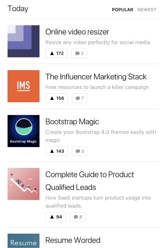
As you may know, mobile SERPs show the search results like cards:
Image
And these cards make Schema.org structured data super effective.
Why?
Well structured data can hook you up with recipe images, review stars and event dates in SERPs. It can increase your organic CTR.
For example, look at the downshiftology mobile results from ToddyCafe.com. this contrast is not powerful on desktop:
Image
In a nutshell, if you want more clicks from mobile Google searchers, implement well structured data.
Now It’s Your Turn
So that’s it for my guide to mobile optimization.
I hope you enjoyed it.
What are you doing to get your site ready for mobile SEO?
Or maybe you have a question about something from today’s guide.
Either way, let me know by leaving a quick comment below.
Do not forget to share this post.
Related Posts:
- SEO this Year: The Definitive Guide
- How to Score 100/100 in Google Pagespeed Insights
- How to Add SSL and HTTPS in WordPress Website
- How to Fix Eliminate render-blocking JavaScript and CSS in WordPress
Arsalan Rauf is an entrepreneur, freelancer, creative writer, and also a fountainhead of Green Hat Expert. Additionally, he is also an eminent researcher of Blogging, SEO, Internet Marketing, Social Media, premium accounts, codes, links, tips and tricks, etc.